Brand values

Leadership and excellence
We are committed towards establishing ourselves as thought leaders in the Agile, DevOps and multi-speed IT arena.

Resolve
Our confidence in our thorough methodologies and objectivity-driven approach warrants purposefulness. We demonstrate immense courage and tenacity at every step of the process.

Value-driven outcome
We enable our customers to realize significant business value by enabling them to derive superlative outcomes and ROI

Relationships
We put our hearts into every alliance, focusing on lifelong mutually-beneficial partnerships and unceasing success for our clients

Integrity
We practice and demonstrate strong ethics and morality by maintaining transparency and taking complete responsibility for our actions.
Logo usage
Identity rules
One has to be extremely cautious while using enreap logo. Make sure the logo open files are not given to associates without locking elements together as represented in the manual. At any given point the logo identity must not be compromised with any alterations. Following are some of the examples.
Do not follow below iterations
Do not contract or stretch the identity disproportionately
Do not alter the color of logotype
Do not add the stroke on identity

Do not place the logotype away from the symbol
Do not rotate the identity

Do not alter the color of logotype

Do not re-align the identity with the symbol
Color palette
Identity proportion
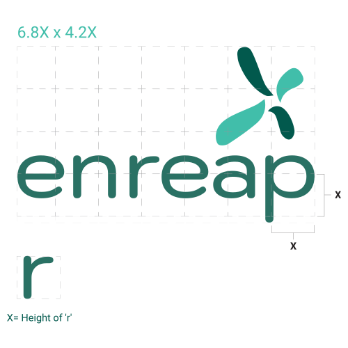
enreap’s identity has been designed to follow a system of proportions.
The grid unit X is the height of “r” in the logotype. To protect the presence, strength and
standardization of the designed corporate identity we create a grid based on the least heighted
letter from the logo type, make a grid and fit the identity in the same grid.
The identity version showcased here in not stacked or stretched but used in the original format.
All mediums will carry this weightage of the identity.
Guidelines:
1. The brand mark (Emblem/Graphical element) should always be accompanied by the logo
Typeface (font) and should not be used independently except in Digital Space and Favicon
2.The logo typeface can be used independently without the Brand mark.
3. The first letter of the brand name must be in small. Never capitalize “e” even if it’s the start of
the statement.
Identity proportion safe space
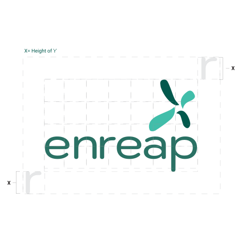
Safe spacing refers to the minimum clearance space which must always surround all slides of
the identity to ensure its prominence and clarity as well as to avoid clutter. No content, image or
element should be placed within this space.
The identity has a safe space of X defined in the previous slide where X is the height of letter “r”
from logotype.
Guidelines:
1. Safe spacing must be considered even while using only typeface logo without brand mark
(emblem) from al sides
2. Mind the safe spaces for all types of designing and productions and especially during
cobranding activities
Identity color & background color variations
Guidelines:
1. The full color version is always preferred and remains the topmost priority to use in
maximum communications.
2. The single color logos is an arrangement during production limitations.
3. All versions including the reverse, white version may be also used against dark background
and vice-versa
4. Below are the only color/background options available and one is supposed to restrict using
any other backgrounds apart from the shown

Full color logo

Grayscale logo

Single color logo

Single color reverse logo

Black and white logo

Grayscale reverse logo

Grayscale white logo

Grayscale black logo
Brand typeface
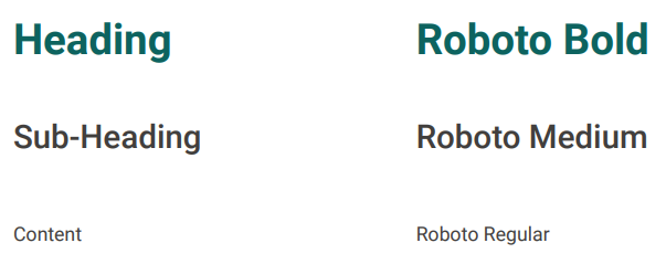
Typefaces aid in the expression of a brand's personality and serve a variety of purposes. The implementation of the same typefaces and typographic techniques across all communications allows our audiences to instantly recognize enreap’s materials. The Roboto font family is a very neat and well-defined typeface that justifies each letter and maintains a decent balance.
Guidelines
1. Sentence case capitalization applicable in following cases
2. Industry terminologies can be capitalized
3. Don't capitalize after a colon
4. Capitalize the first letter of all quotes
5. Capitalize values
6. All caps in not applicable to any context
System Fonts
For all the day to day communication or systems we shall use Arial or Calibri. Any customer communication and branded collateral will follow Roboto
Rules of capitalization
Do’s
- First word of title in decks.
- First letter in every sentence.
- Initial letters of proper nouns.
- Pronoun “I”.
- The first word of a complete sentence following a colon.
- First word in interjections and incomplete sentences.
Don’ts
- Don’t capitalize “enreap” word in any position.
- Don’t capitalize after a colon.
- Don’t capitalize Seasons.
- Don’t capitalize little words within a title.
- Don’t capitalize prepositions.
- Don’t capitalize short prepositions like “to, for, in, of, from, on”.
Affiliated color ratios
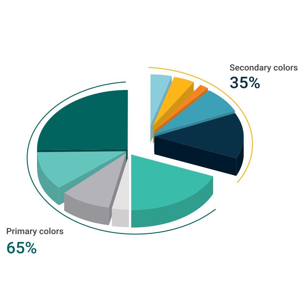
Primary colors
Secondary brand colors act as a complimentary color palette to the primary brand colors. These
colors are updated more frequently and often change to reflect strategy trends and marketing
goals.
For example, if you want to target younger clients then you may be adjusting your secondary
color palette to reflect current color trends that appeal to a younger demographic.
The secondary brand colors can be used throughout your brand’s website, social media, and
packaging but should not consist of more than 50% of the overall design.
Secondary colors
Secondary brand colors act as a complimentary color palette to the primary brand colors. These
colors are updated more frequently and often change to reflect strategy trends and marketing
goals.
For example, if you want to target younger clients then you may be adjusting your secondary
color palette to reflect current color trends that appeal to a younger demographic.
The secondary brand colors can be used throughout your brand’s website, social media, and
packaging but should not consist of more than 50% of the overall design.
Iconography

Contact us

DevOps

Agile

Digital Transformation

Global Support

DevOps

PPM

Cloud

ITSM

Consulting

Delivery

Operation
Pattern options & usage
Thought line of brand pattern
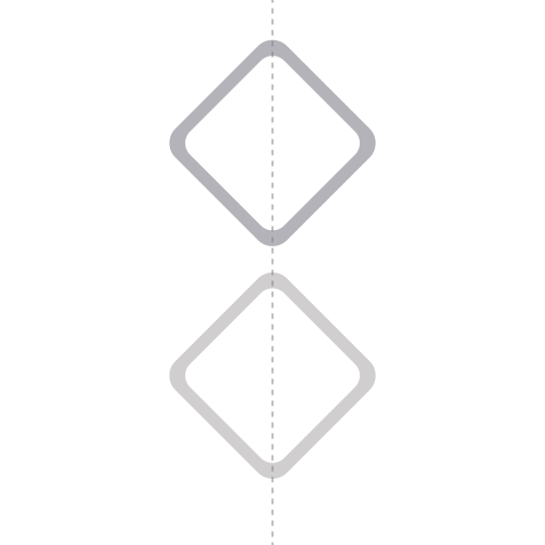
The 4 squares represent 4 domains of enreap. Their placement represents continuous
momentum. In order to make the pattern scalable and easy for application we have opened
multiple patterns which can be utilized for communication materials. One can use multiple
combinations showcased below while designing any communication materials with following.
Guidelines:
1. Avoid using pattern in content heavy official documents instead play with primary color
bands. We have designed a separate dark green separating line along with a dark green patch
where ever we are not using pattern
2. Brand Patterns can be used wisely as per the design requirement and space availability
3. One can use exact vertical or horizontal half cut pattern
4. The shape of the pattern can be adapted for infographics and image treatments
5. Colors of the pattern are inter-changeable however stick to only primary and supportive
color palette

Pattern option 1
Place each element apart

Pattern option 2
Overlap the patterns

Pattern option 3
Place each element apart

Pattern option 4
Use each element from the pattern separately

Pattern option 5
Place each element apart

Pattern option 6
Min (30pts) Max (100pts)

Pattern option 7
Cut the pattern along the centre of either of the squares.
Pattern option 8
Cut the pattern along the centre of the squares.

Pattern option 9
Cut the pattern along the centre of any of the squares for corner design.

Pattern option 10
Place each element apart.

Pattern option 11
Min (2pts) Max (6pts)
enreap pronunciation
Right pronunciation
In english
en reep
(en - Pause - reep)
हिन्दी
एन-रीप
Wrong pronunciation
enreep
en rip
enrip
Cobranding rules
Departmental architecture
All departments under enreap will use enreap’s main identity with or without tagline.
For other associations
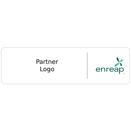
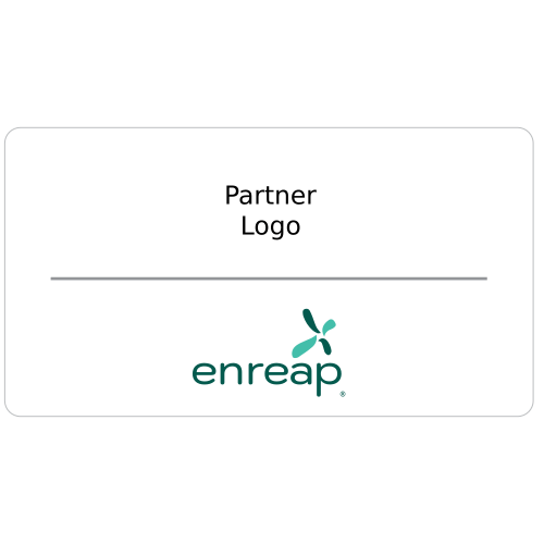
The cobranding rules of enreap will be decided based on the type of associations the brand will
enter in along with the project revenue sharing.
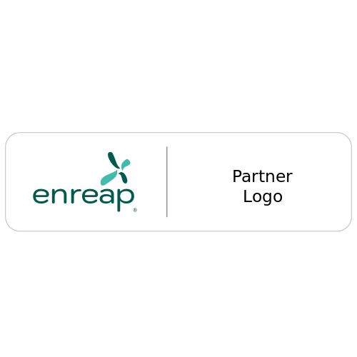
1. Equal partnership :
These types of associations will carry equal stakes (50:50), the identities will carry equal sizes.These types of associations will carry equal stakes (50:50), the identities will carry equal sizes.
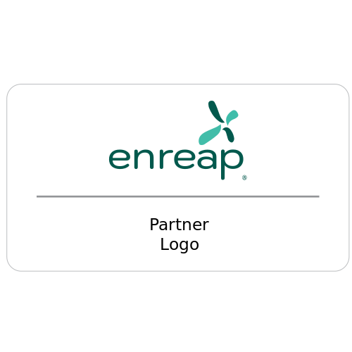
2. More than 50%
enreap with >50% stake with 3/4th visual space.
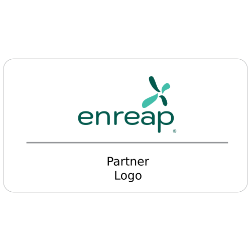
3. Less than 50%
enreap with <50% stake with 1/4th visual space.
